Fans couldn't find what they came for
Search that
actually finds it
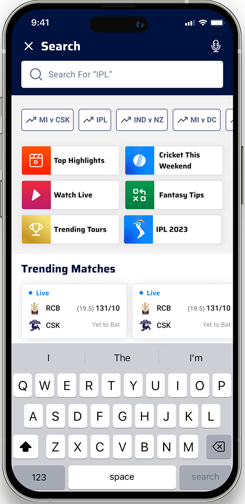
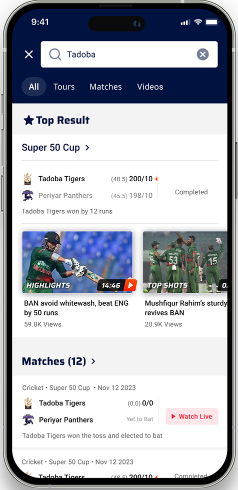
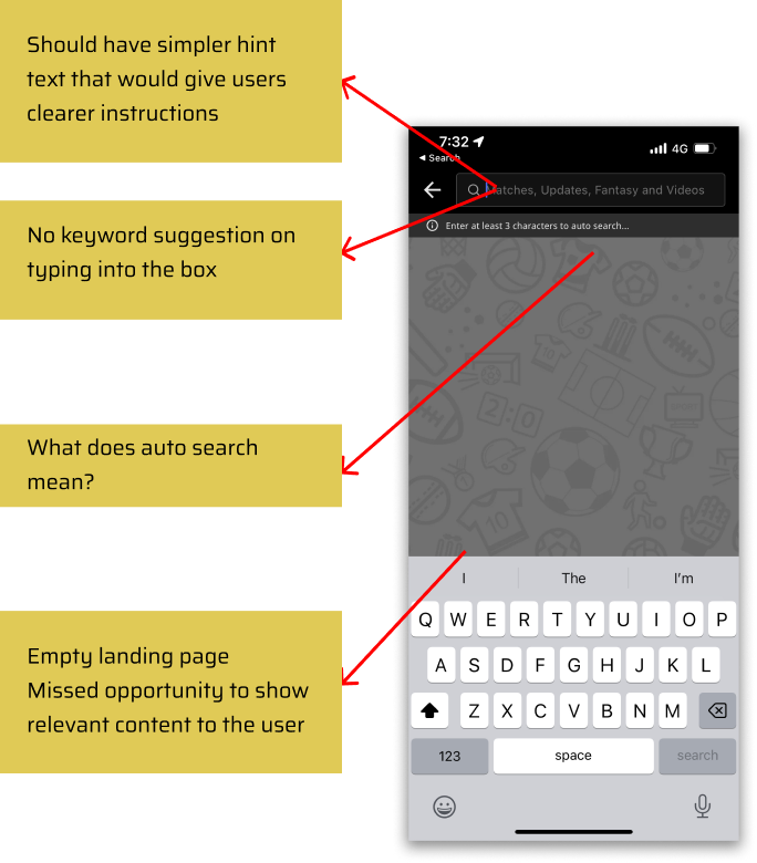
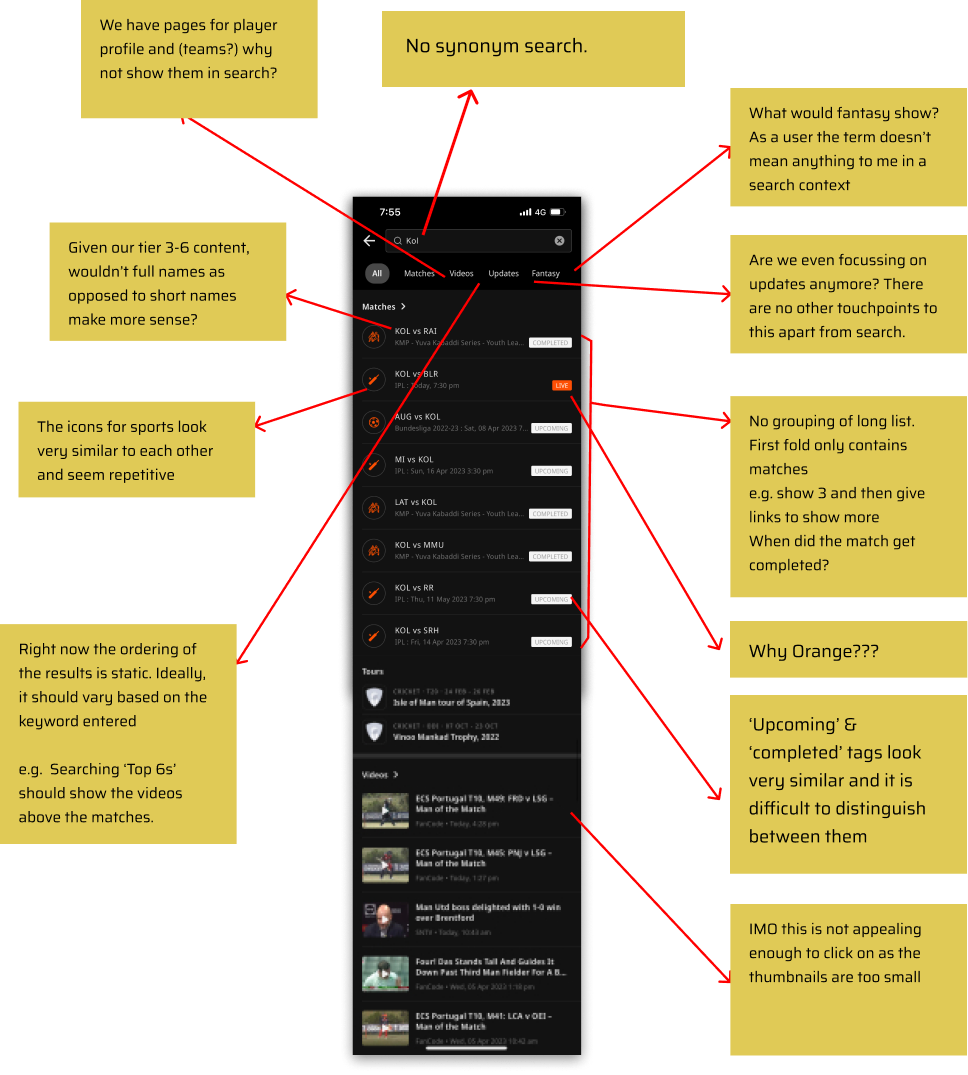
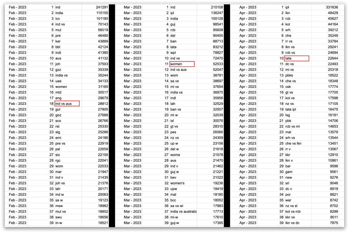
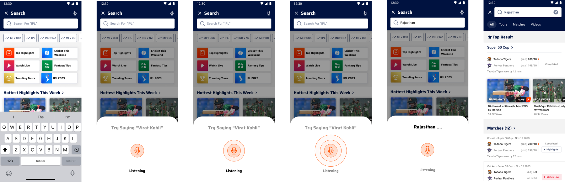
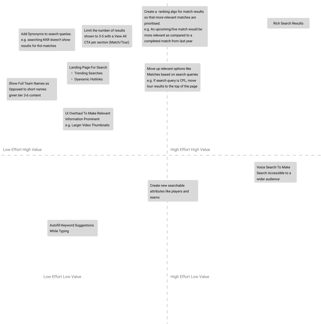
FanCode's search was leaking users — slow to surface relevant content, easy to abandon. I audited it end to end and rebuilt it around how fans really search for sport: short names, sponsors, and the fastest path to a match, stat or video.
6 mo
Of top-query & CTR data analysed
5
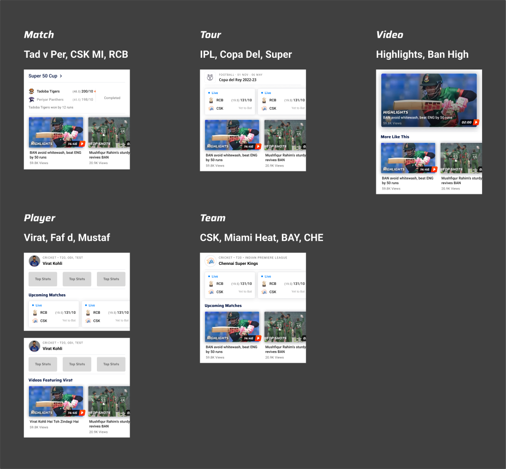
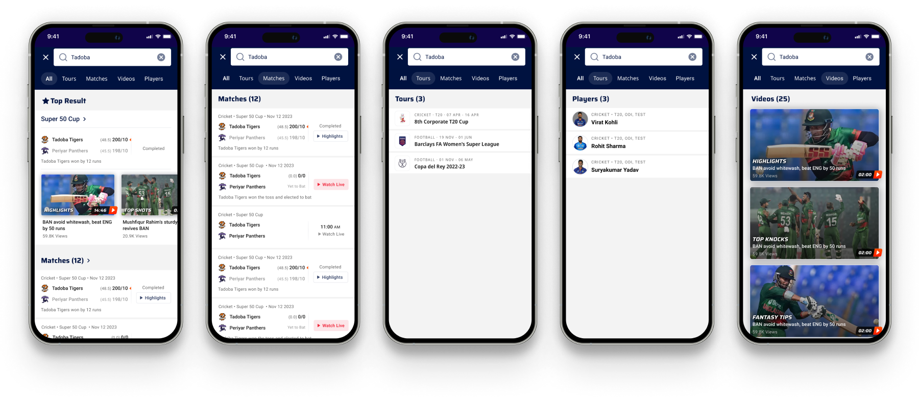
Result types — Match, Tour, Video, Player, Team
0-tap
Keyboard & trending surface on launch