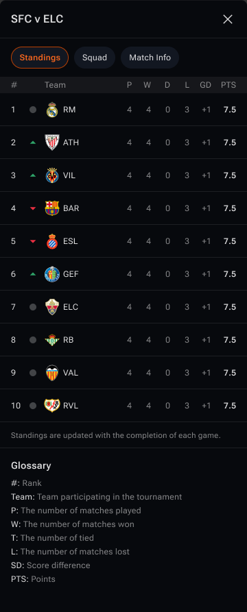
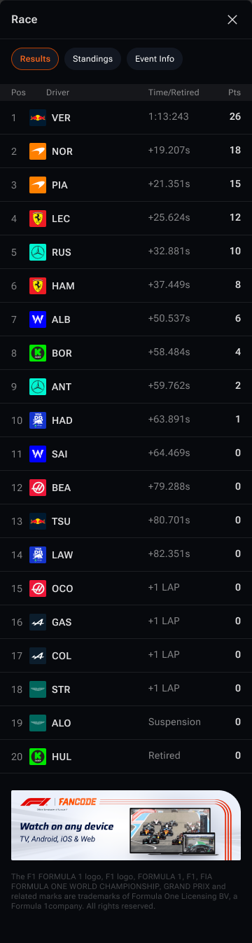
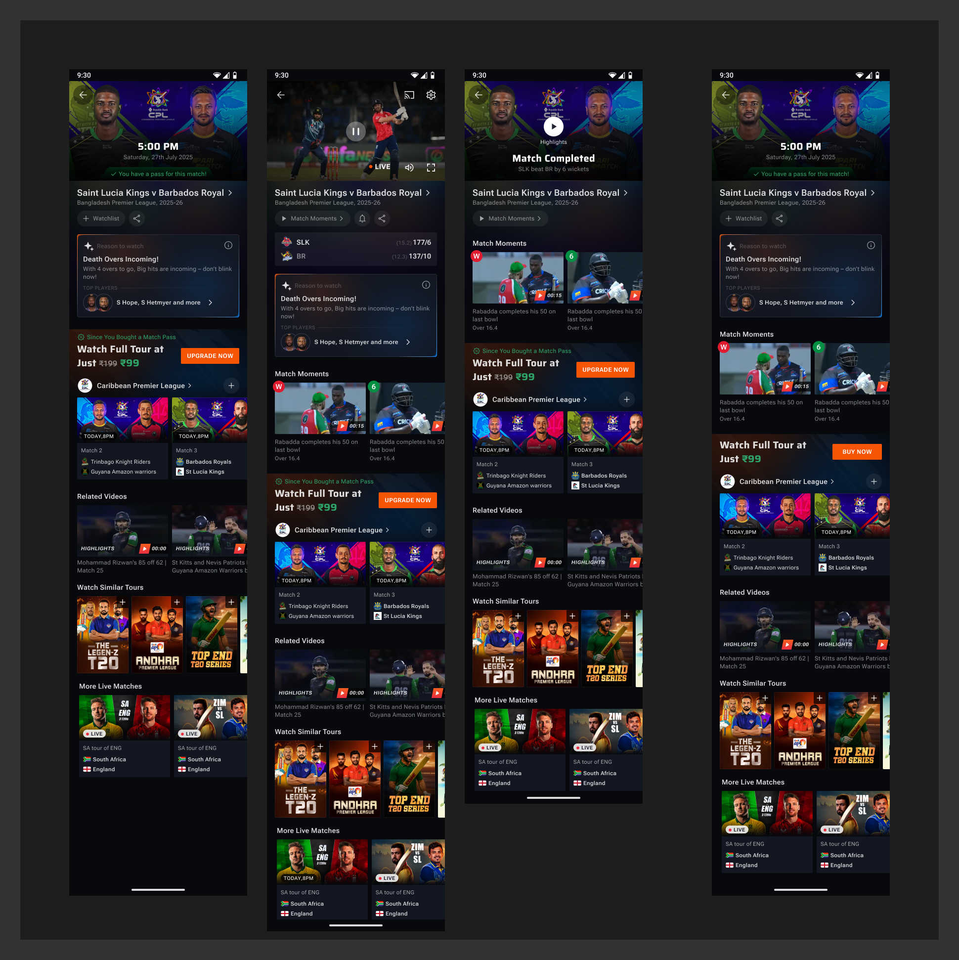
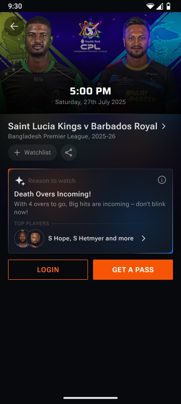
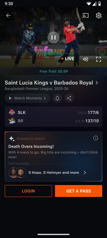
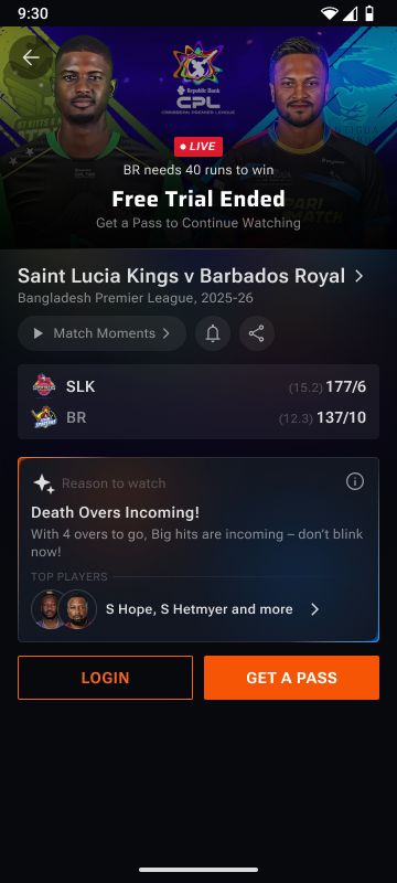
FanCode's highest-traffic surface
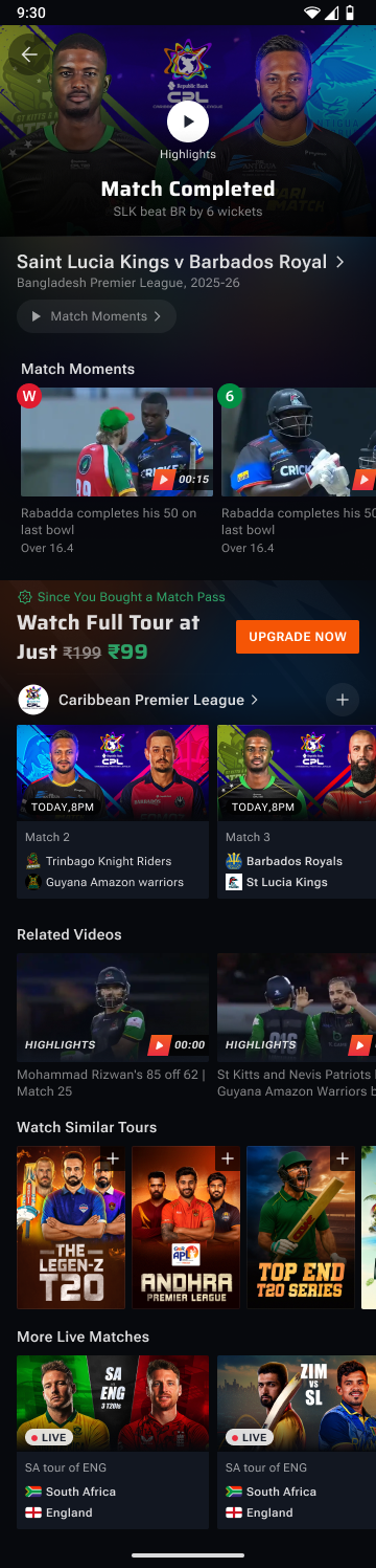
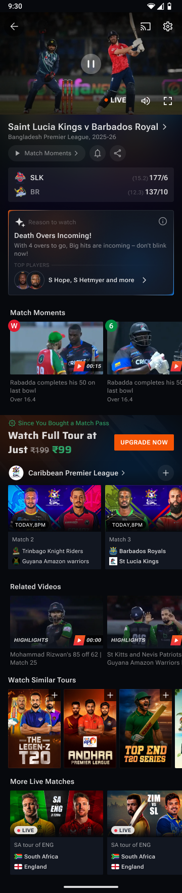
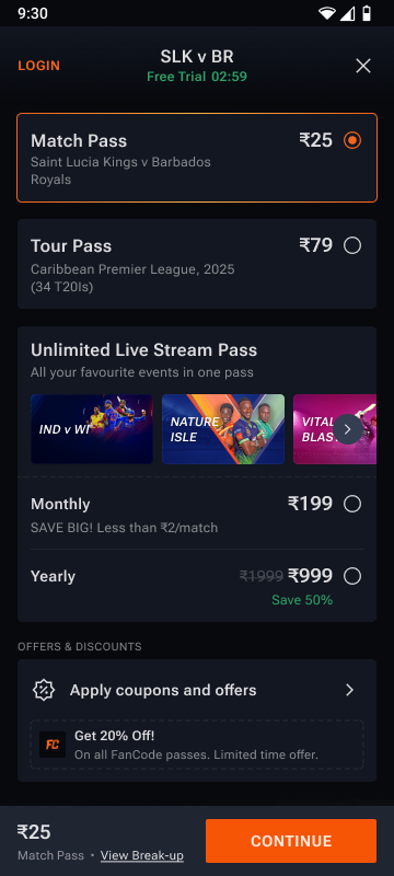
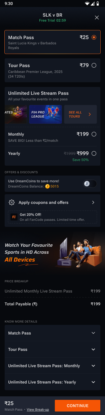
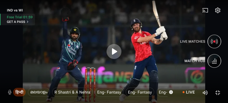
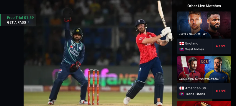
Match Detail 2.0 — a video-first conversion engine
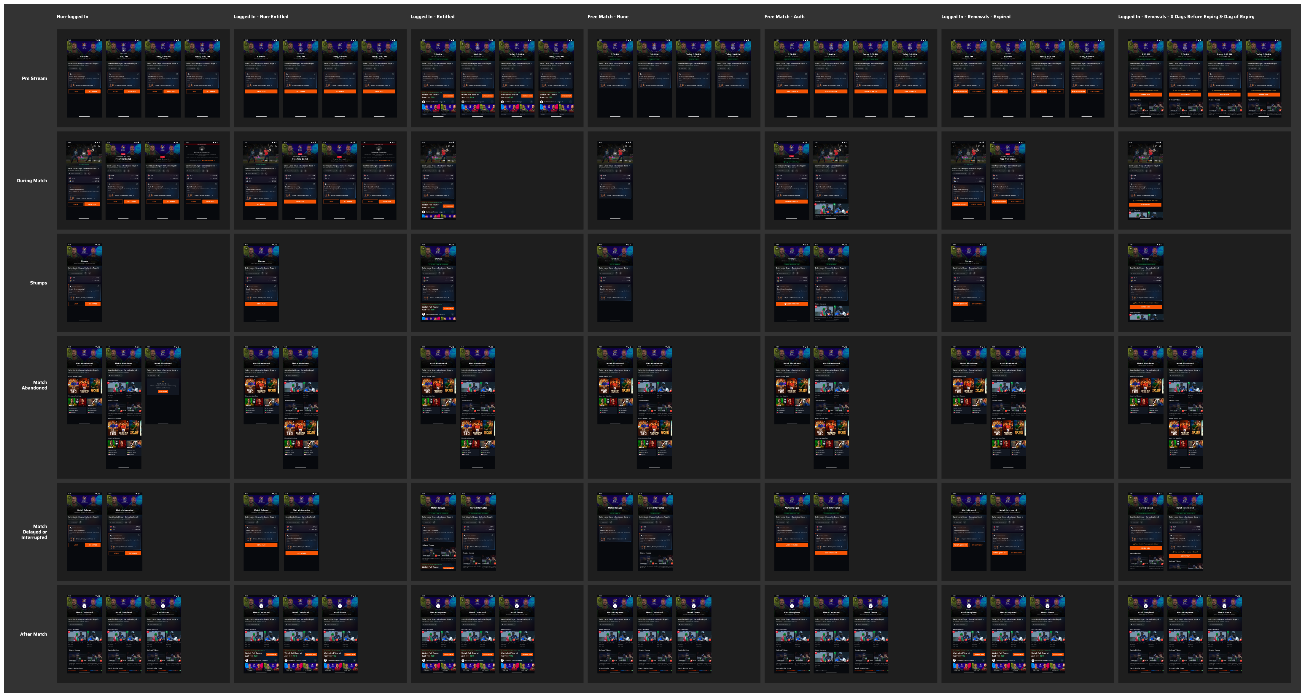
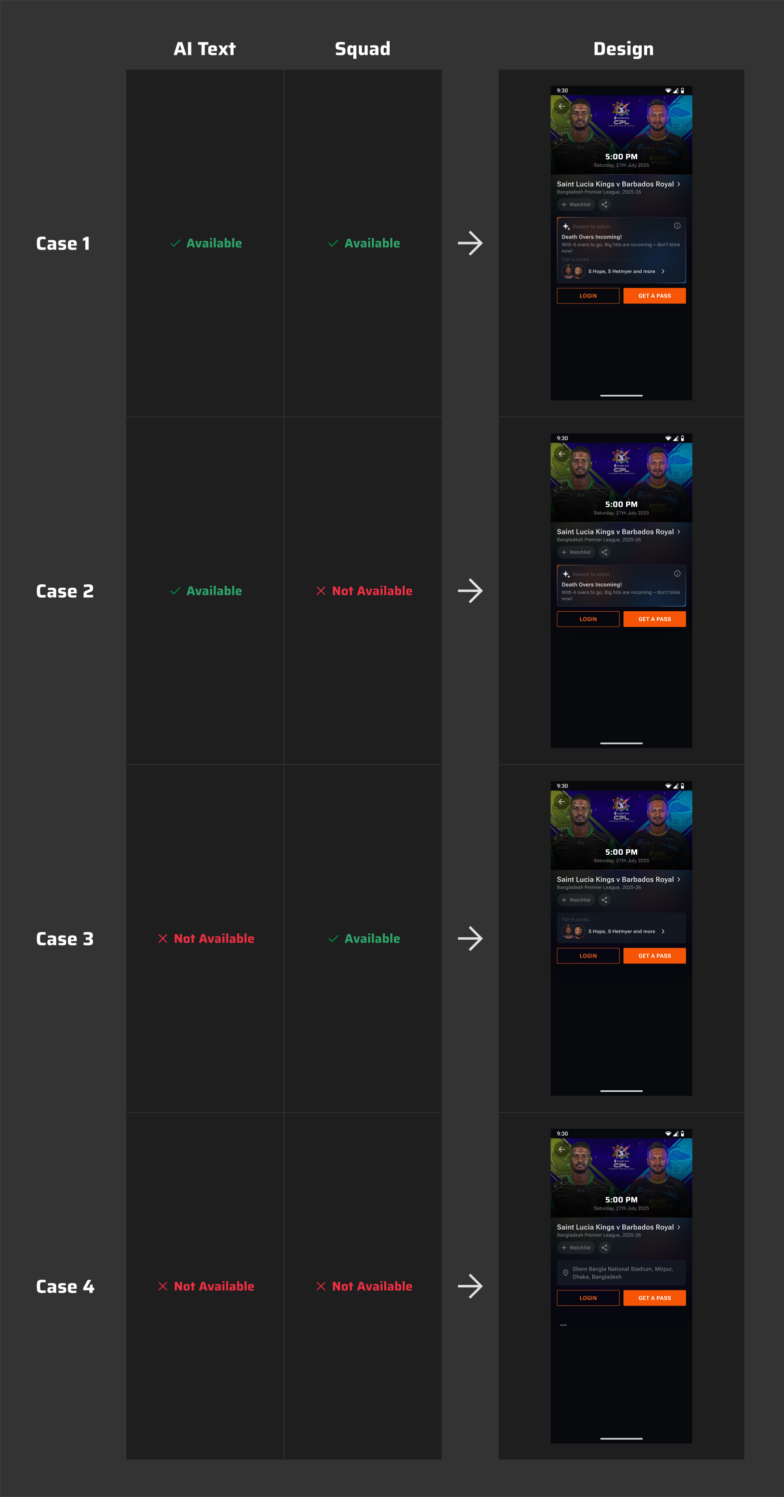
Rebuilding the page where every FanCode journey ends up — so that AI-led storytelling tells fans why a match matters, distractions disappear before conversion, and the right content surfaces for every entitlement at every match state.
30+
Entitlement × state combinations
60s
AI reason-to-watch polling rate
4
Sports · Cricket, Football, F1, MotoGP
Scroll to explore